B2B Dashboard: 10 Essential Design Decisions
B2B dashboards are not landing pages. They are not consumer apps. They are not screens a user visits once a week for a few seconds. They are work environments where analysts, managers, and operators spend hours per day making decisions based on what they see.
That context changes everything. Every design decision that makes sense for a consumer product can be a serious mistake in a B2B dashboard. Delightful animations become distractions. Generous spacing becomes a waste of valuable real estate. Progressive onboarding becomes condescension for someone who has used the tool 200 times already.
The ten decisions below are the ones that most frequently determine whether a dashboard will actually work or end up replaced by a spreadsheet.
Information Density: More Is More for Power Users
In consumer product design, there is an almost universal rule: simplify, reduce, eliminate. In B2B dashboards, that rule needs calibration.
Power users — financial analysts, operations managers, traders — develop a mental model of the information space over time. For them, seeing 20 KPIs on the same screen is not cognitive overload: it's efficiency. Having to navigate across four screens to see what used to fit on one is what creates load.
The correct decision is not "less is more," but rather "how much information does this specific user need to see simultaneously to make a decision?"
The practical tool here is defining usage profiles by role before designing any screen. A CFO looking at financial health metrics has different needs from a support analyst monitoring open tickets. The same screen rarely serves both well.
A useful heuristic: operational monitoring dashboards (NOC, support, logistics) tolerate — and benefit from — high density. Executive and reporting dashboards should be more spacious because the usage context is different: meetings, presentations, quick overviews.
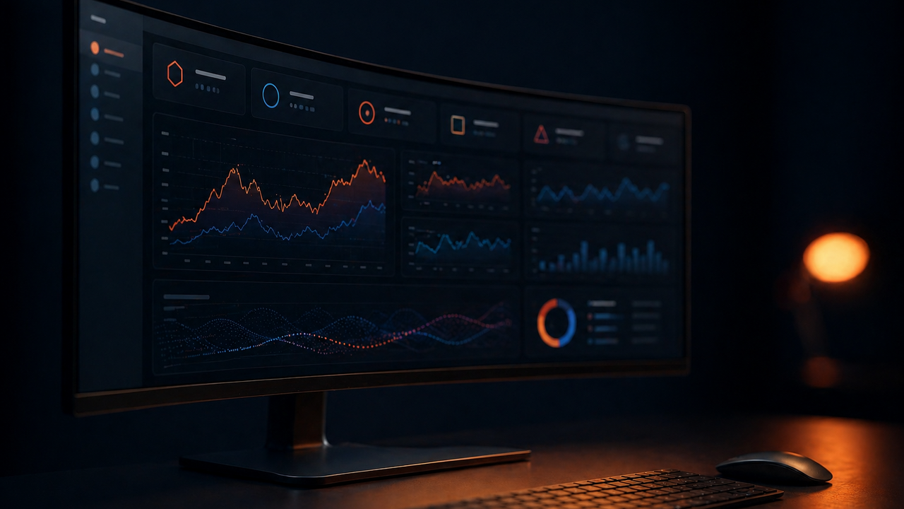
Visual Hierarchy: What Eyes Read First
In a typical dashboard screen, dozens of elements compete for attention. Visual hierarchy defines the sequence in which the eye will move through those elements — and poorly designed dashboards have no hierarchy: everything shouts at the same intensity.
The recommended structure for most B2B dashboards follows three levels:
| Level | Content | Visual Treatment |
|---|---|---|
| 1 — Critical | Primary KPIs, alerts, overall status | Large, prominent, accent color |
| 2 — Contextual | Trend charts, period comparisons | Medium, center position |
| 3 — Detail | Tables, lists, granular data | Smaller, lower or side area |
The most common mistake is placing beautiful line charts at level 1 when the user needs to see the absolute number first. Charts are good for context and trend, but numbers are faster for answering "is this good or bad right now?"
Another fundamental principle: use color with intent. Color is not decoration in dashboards — it's signal. If you use red to indicate a revenue drop, don't also use red in the navigation menu or decorative icons. The dashboard's color system needs to be consistent enough that the user, after a few weeks of use, automatically decodes color as information.
Global vs Local Filters: How to Decide
One of the most recurrent debates in dashboard design is where to place filters and what scope they should have.
Global filters — typically at the top or in a sidebar — affect the entire screen simultaneously. Local filters are coupled to a specific widget and affect only that component.
The decision depends on how the user thinks about the data. If the main segmentation method is by time period or by organizational unit (company, branch, region), those filters should almost always be global. The user wants to say "show me everything for August, for the North region" — they don't want to go widget by widget applying the same filter.
Local filters make sense when different widgets represent fundamentally different entities that don't share the same segmentation axes. A panel showing marketing metrics alongside support metrics can have local filters because "campaign" only makes sense on one side and "ticket category" only makes sense on the other.
The trap is having global filters that silently don't apply to some widgets. If the user selects "August" in the global filter but a chart keeps showing full-year data without visual indication, trust in the dashboard is destroyed. Consistency and transparency in filter behavior are non-negotiable.
Configurability: Letting Users Build Their Dashboard
Configurable dashboards — where users can add, remove, reorder, and resize widgets — are a seductive promise. "Each user sets up the dashboard the way they need it."
In practice, most users never configure anything. Usage studies of tools like Grafana and Tableau show that the vast majority of users use default settings their entire time with the tool. Configuration complexity ends up being a barrier.
This doesn't mean configurability is useless — it means it doesn't replace good default design decisions. The default dashboard needs to work for the typical user without any configuration. Configurability serves power users, who are a minority but often the most vocal about specific needs.
If you're implementing configurable dashboards, best practices include:
- Offer pre-configured templates by role (manager dashboard, analyst dashboard, director dashboard)
- Allow saving and sharing configurations across teams
- Make it visible when a user is viewing a configuration different from the company default
The Opinionatedness vs Configurability Decision
Successful software products are opinionated. They say "here's the best way to do X" instead of "configure however you want." In B2B dashboards, this means having the courage to design a specific analysis flow instead of delivering a configurable blank canvas.
A concrete example: instead of letting the user choose which KPIs to display, you can design a screen that always shows gross revenue, churn, and NPS together because the business logic says these three numbers must be read together to understand product health. That's a point of view. It's harder to justify in a stakeholder meeting, but it produces dashboards that educate users about what matters.
The tension between opinionatedness and flexibility is where most B2B dashboards fail. Either they're so flexible they have no personality and each team uses them differently, or they're so rigid that teams create parallel spreadsheets to cover what the dashboard doesn't.
The Other Five Decisions
The remaining five decisions that complete the ten essentials are: theme mode (dark mode for monitoring environments, light for executives), real responsiveness vs adaptation (mobile in B2B dashboards rarely works well — be honest about this), loading states and missing data (what to show when a query is slow or returns empty), drill-down (how to go deeper on a number without losing the overall context), and notifications and alerts (the dashboard as an alert system, not just a consultation tool).
Each of these decisions has trade-offs that depend on the product's specific context, user profile, and available data infrastructure.
Conclusion
B2B dashboard design is both a technical and a strategic discipline. The decisions discussed here don't have a universal right answer — they have a right answer for a specific context.
What differentiates dashboards that become a reference inside companies from those that get abandoned is not the framework used, the charting library chosen, or the number of widgets available. It's the quality of design decisions made before writing the first line of code.
At SystemForge, this process begins in the brief phase: we understand who will use the dashboard, how often, and to make what type of decisions. Only then do we design the information architecture and visual hierarchy. If you're building or revamping a B2B dashboard, that's the kind of process that prevents expensive rework.
Need help?